Dialer Dashboard Panels
Use this page when you want to go deeper than the full Dialer dashboard screenshots. Each section isolates the Grafana panels and explains what the data means in operational terms.
The live panels refresh frequently and show the current Prometheus values. The performance panels use the selected Grafana time range, so changing the time picker changes those totals, percentages, and averages.
Real-Time Overview
Start here during an outbound run. This view combines live campaign state with outcome totals, dialing pressure, active calls, configured limits, and per-campaign status.
What each panel represents
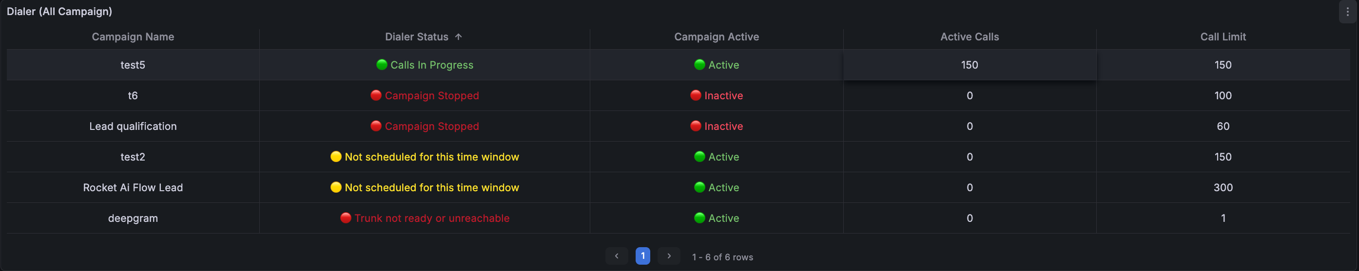
Dialer table
Lists every campaign with Campaign Name, Dialer Status, Campaign Active, Active Calls, and Call Limit. Read the status first: Calls In Progress is healthy; No Available Contacts means the list is empty or exhausted; Campaign Stopped means it is not running; Not scheduled means the current time is outside the campaign window; trunk warnings mean telephony setup or trunk reachability must be fixed before calls can flow.
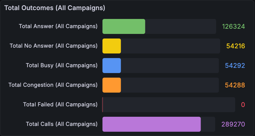
Total Outcomes
Shows the current daily count for each outcome across all campaigns. Read it as a simple scoreboard: Answer means the call was answered, No Answer means nobody picked up, Busy means the line was busy, Congestion means the telephony side could not complete the call cleanly, Failed means the call failed, and Total Calls is the overall call count for the day.
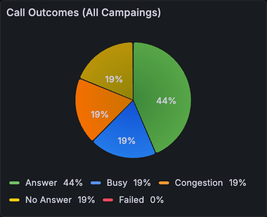
Call Outcomes
Shows the same daily outcomes as percentages. Use it when totals are high and you want to understand the mix quickly: a larger Answer slice is good, while larger No Answer, Busy, Congestion, or Failed slices show where call quality or telephony delivery may need attention.
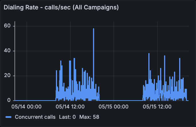
Dialing Rate
Shows the all-campaign calls-per-second signal over time. Higher peaks mean the dialer is trying to place calls faster. A flat line near zero usually means campaigns are idle, stopped, outside schedule, or have no contacts ready.
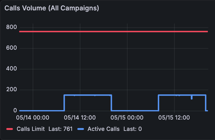
Calls Volume
Compares the configured Calls Limit with the number of launched or active calls. Read the red line as the ceiling and the blue line as usage. If blue stays close to red, the dialer is using almost all available capacity; if blue is far below red, there is still room to launch more calls.
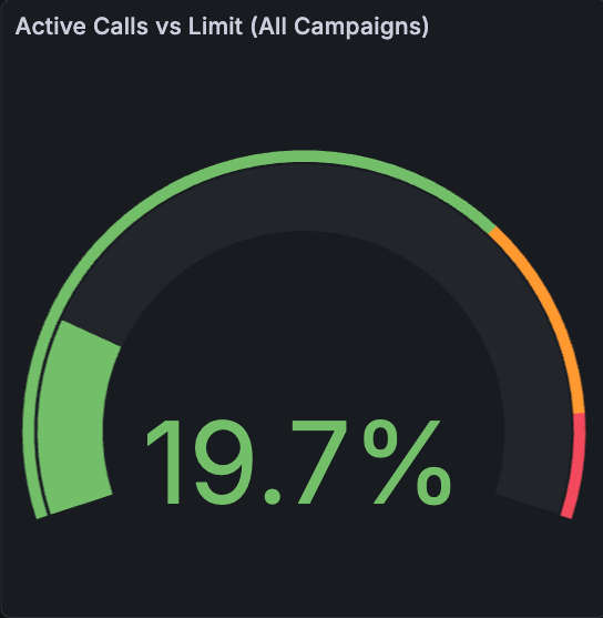
Active Calls vs Limit
Shows Active Calls divided by Calls Limit as a percentage. Green means there is capacity left, orange means usage is high, and red means the dialer is close to the configured ceiling. Use this before increasing pacing or campaign limits.
Real-Time Agents & Trunks
Use this view when the campaign is active but calls are not behaving as expected. It separates campaign logic from telephony readiness by showing endpoint state and timeline changes.
What each panel represents
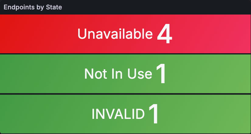
Endpoints by State
Shows how many endpoints or trunks are in each state. Not In Use means the trunk is registered and free. In Use means the trunk is handling a call. Busy, Ringing, or Ring + InUse indicate other call-related states. Unavailable, Unreachable, Invalid, Offline, or Unknown mean the endpoint is not ready: check registration, provider, and endpoint configuration.
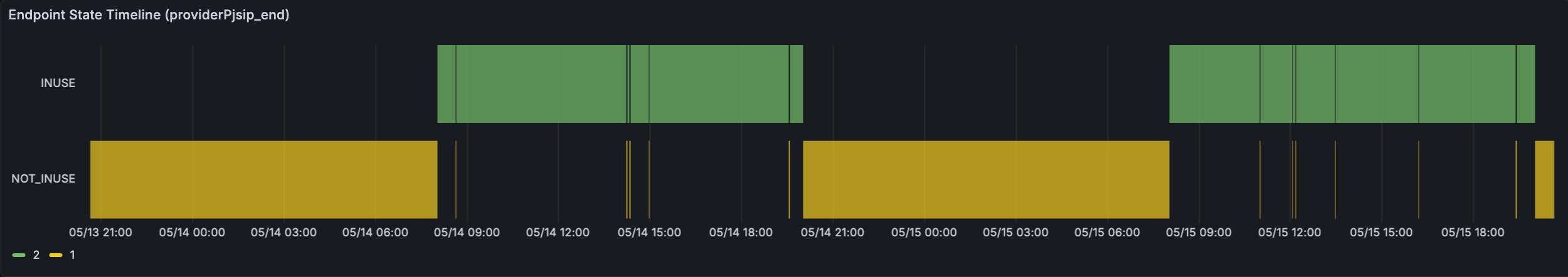
Endpoint State Timeline
Shows how the selected endpoint changed state during the time range. Read it from left to right: long green sections usually mean the endpoint was idle and available, while In Use or busy sections show when calls were active. Sudden unavailable or invalid sections help explain call failures.
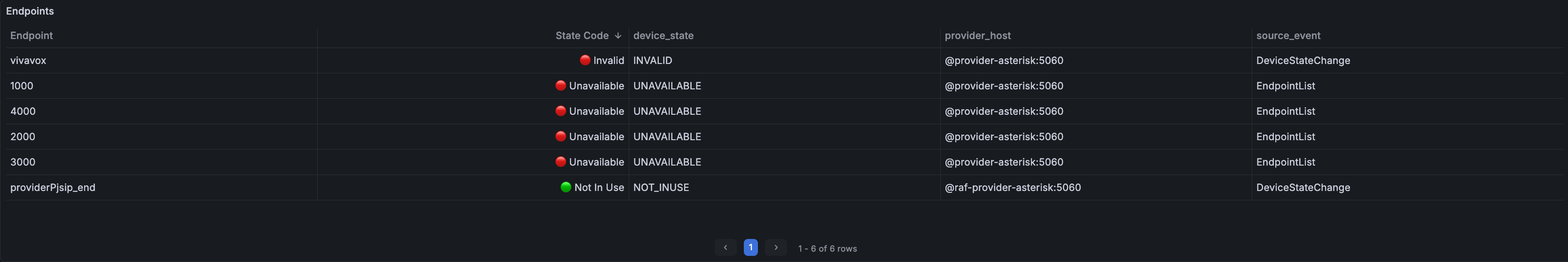
Endpoints table
Shows the raw endpoint list behind the summary: endpoint name, state code, readable device state, provider host, and source event. Use it to find the exact endpoint to troubleshoot, especially when the summary shows Unavailable, Unreachable, Invalid, or Offline.
All Campaigns Performance
Use this view after or during a wider outbound window when you want to evaluate the combined performance of every campaign in the selected time range.
What each panel represents
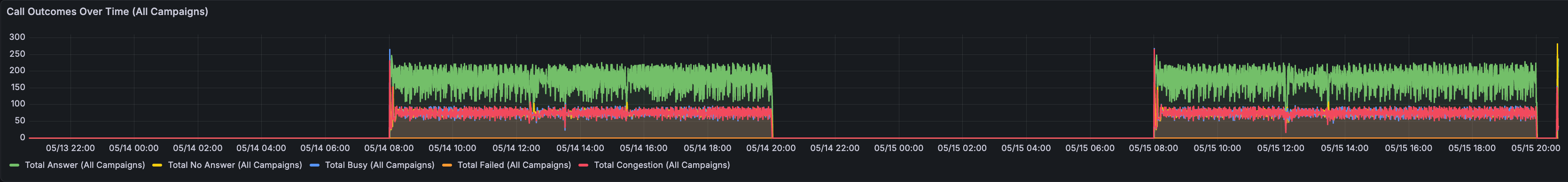
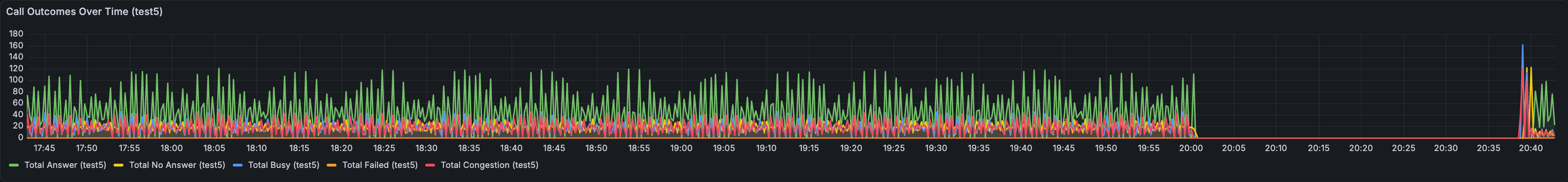
Call Outcomes Over Time
Shows how many new outcomes were added in each time bucket across all campaigns. Read the lines as trend, not lifetime totals: a green rise means more answered calls in that period; yellow, blue, orange, or red rises show more no answers, busy lines, congestion, or failures.
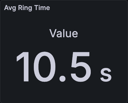
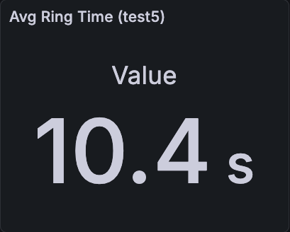
Avg Ring Time
Shows average ring duration in seconds for the selected range. Higher values mean calls spend longer ringing before answer, failure, or timeout. Use it to spot contact availability or carrier behavior changes.
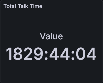
Total Talk Time
Shows total connected talk time produced by all campaigns in the selected range. This is the easiest way to see how much real conversation time the dialer generated.
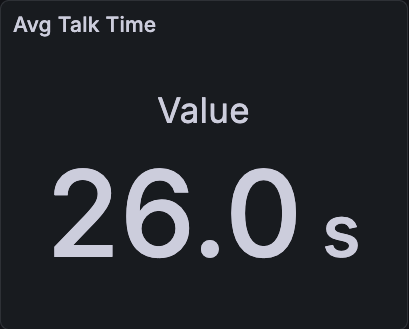
Avg Talk Time
Shows average connected conversation time in seconds for the selected range. It is calculated from total talk time divided by the number of measured conversations. Higher values usually mean longer conversations; very low values can point to early hangups or weak contact quality.
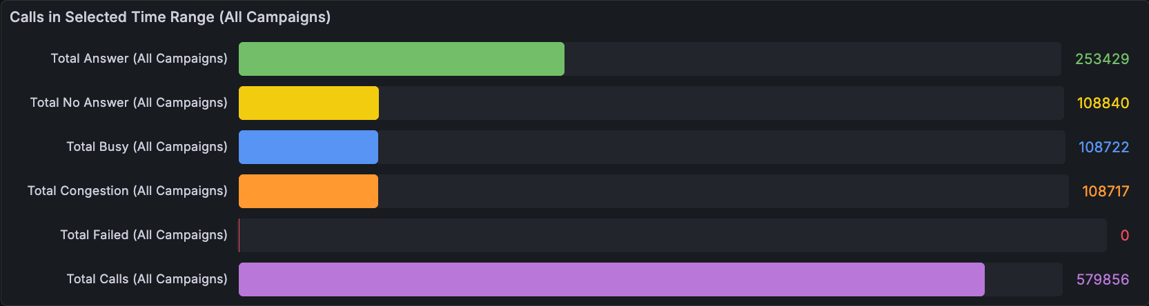
Calls in Selected Time Range
Shows totals calculated only for the selected Grafana time range. If you change the time picker, these numbers change. Use it for reporting a specific window, such as the last 30 minutes, today, or one campaign run.
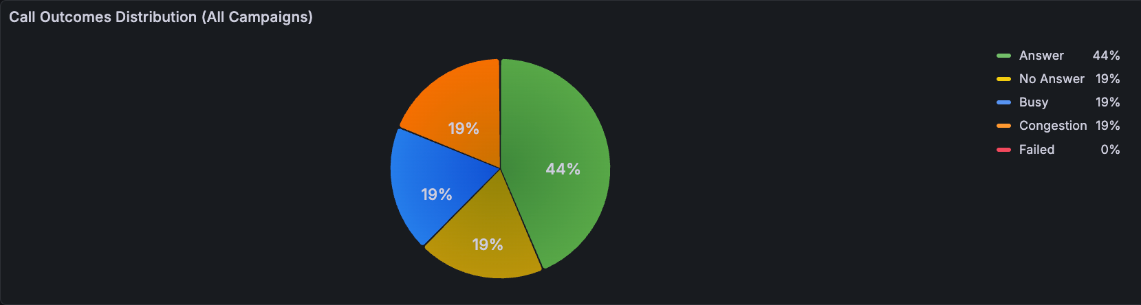
Call Outcomes Distribution
Shows the selected time range as percentages instead of counts. Use it to judge call quality at a glance: compare the Answer share against No Answer, Busy, Congestion, and Failed.
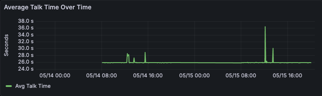
Average Talk Time Over Time
Shows average talk time per time bucket. A stable line means conversation length is consistent; spikes or drops show periods where calls became longer or shorter.
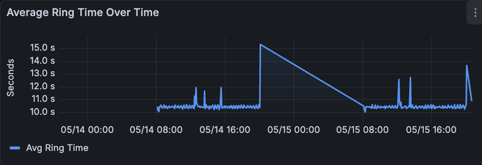
Average Ring Time Over Time
Shows average ring time per time bucket. If the line rises, calls are taking longer to answer or end. That can indicate contact-list quality, carrier behavior, or endpoint issues.
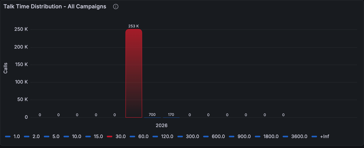
Talk Time Distribution
Groups calls by talk-time bucket in seconds. Taller bars show where most conversations fall. Use it to see whether the campaign traffic is mostly short calls, normal conversations, or long outliers.
Single Campaign Performance
Use this view when one campaign needs its own review. It keeps the same operational metrics as the aggregate view, but filters the analysis to a single campaign.
What each panel represents
Call Outcomes Over Time
Shows new outcomes per time bucket for the selected campaign only. Use it to see whether one campaign is improving, degrading, or showing a specific period with more no answers, busy lines, congestion, or failures.
Avg Ring Time
Shows average ring duration for this campaign. Use it to compare contact reachability and telephony behavior against other campaigns or time windows.
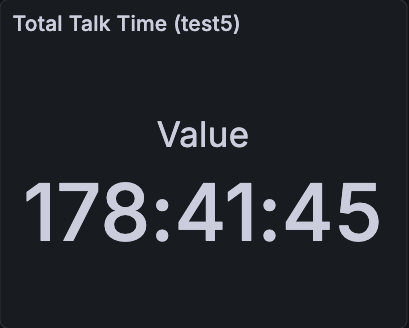
Total Talk Time
Shows the total connected talk time generated by this campaign in the selected range. It measures the real conversation output of that specific outbound run.
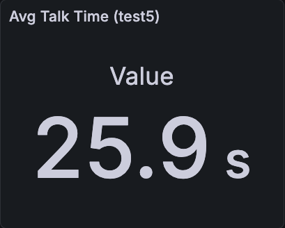
Avg Talk Time
Shows average connected conversation time for this campaign. Use it to understand whether this campaign is producing meaningful conversations or mostly short interactions.
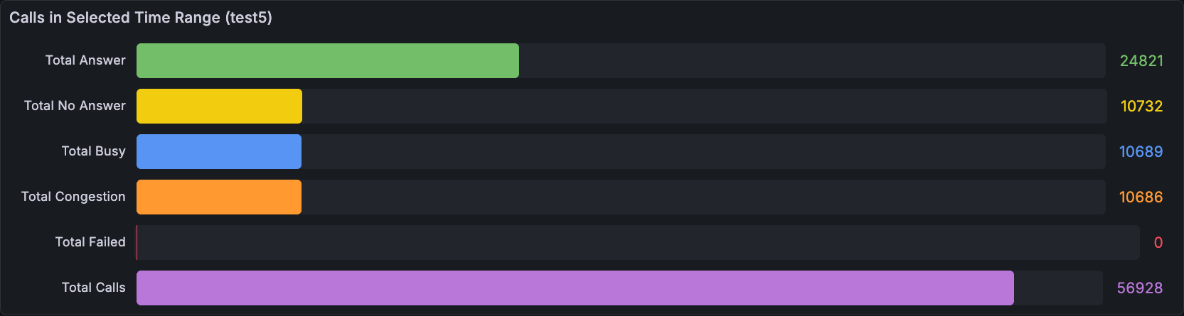
Calls in Selected Time Range
Shows totals for the selected campaign and selected Grafana time range. Use this when you need campaign-level reporting instead of totals mixed across all campaigns.
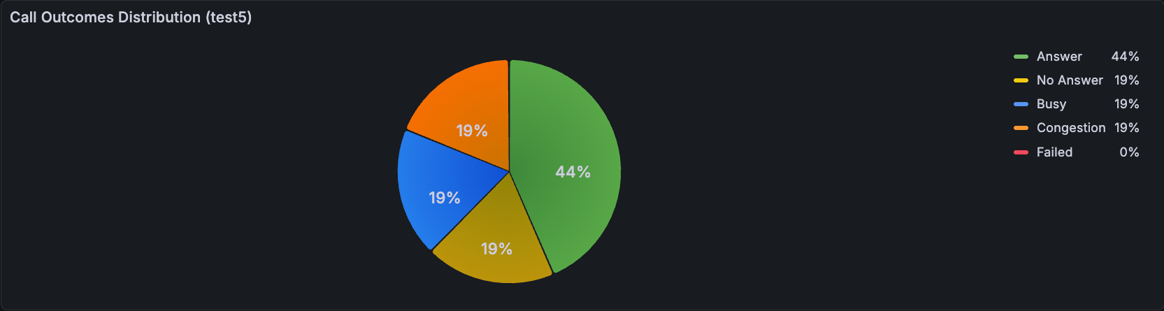
Call Outcomes Distribution
Shows the selected campaign as percentages. Use it to compare one campaign with another: a stronger campaign usually has a larger Answer share and lower Congestion or Failed share.
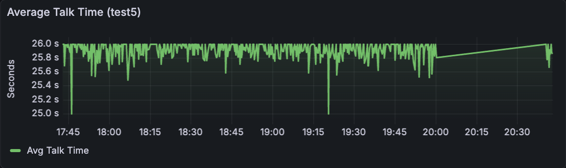
Average Talk Time
Shows how average talk time changes during the campaign. Use it to identify moments where conversations become shorter, longer, or less stable.
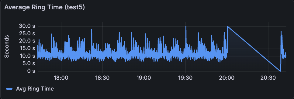
Average Ring Time
Shows how ring time changes during the campaign. Spikes can indicate contact availability changes, carrier behavior, or temporary endpoint or trunk issues.
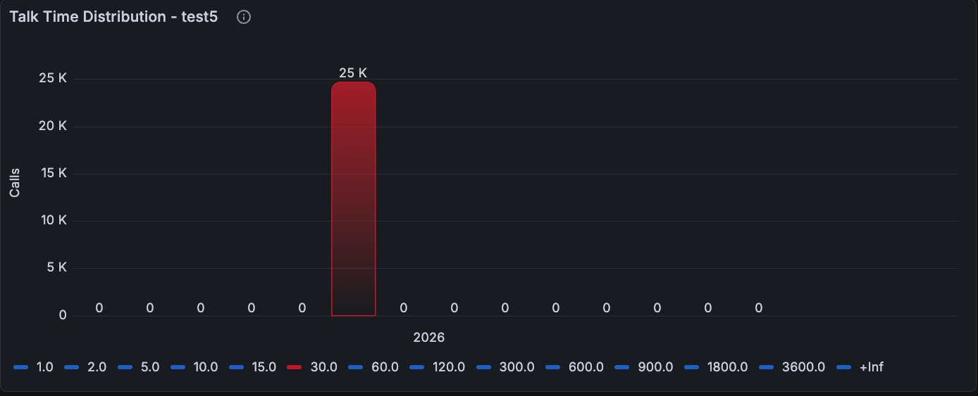
Talk Time Distribution
Groups this campaign's calls by talk-time bucket in seconds. Use it to see whether the campaign is dominated by short calls, normal conversations, or long outliers.